Inbox one

The ‘inbox zero’ idea is part of a digital lifestyle focussed on optimizing personal productivity. It means: no unread emails, or more generally: every item on the todo list is crossed off. It is the zen state the information worker hopes to achieve.

Of course, social media tools make it all too tempting to share the inbox zero moment with the rest of the world.

@inbox_was_zero is was a bot that finds people on Twitter who announced they ‘achieved’ inbox zero. The bot congratulates them for this achievement with a Twitter @reply. Most people have their Twitter account setup to receive an email notification when they are mentioned in such a reply. The bot thus effectively destroys the inbox zero moment.

Twitter explicitly states that this kind of bots is forbidden: “sending automated @replies based on keyword searches is not permitted”.

Even though some precautions were taken (I was careful not to send to many messages at once, and there was some rate limiting built in), the bot was blocked a couple of times by Twitter, and completely suspended after a few hours.

The bot sent 33 tweets. Some people were sympathetic to the idea, while others were irritated.

Here are some screenshots.

Screen Shot 2014-02-27 at 21.56.33

Screen Shot 2014-02-27 at 21.57.19

Screen Shot 2014-02-27 at 21.54.17

Screen Shot 2014-02-27 at 21.54.38


Rekall Christmas 2013 posters

During the last days of 2013 Ingrid and me (working together as Rekall Design) decided to send our clients a little thank you for working with us the past year. Although we didn’t have a lot of time, we still wanted to do something more original than the typical Christmas card.

We build sites, so we thought our clients would be interested to see how their website was used in the past year. That’s how we came up with the idea to send each client a personalized poster visualizing the daily number of visitors in 2013. Here are some of the results. (Site names and number of visitors censored for privacy reasons.)

christmas_card_01

Each ray in the poster represents one day. The more visitors on that day, the longer the line is. This poster is for a website back in January, so those short lines in January, February and the beginning of March are us and the client’s team setting up the site. Then in the middle of March the site was launched with a press conference – that’s why there are some very long lines there.

christmas_card_02

This is a website for a school. Summer months are very quiet, and the start of the academic year is clearly visible. Outliers correspond to events important to the school, for example open days.

christmas_card_03

And this poster is for an artist’s site. The graph hints at what were important events in 2013 for this client: exhibitions, lectures, etc.

Technical details:

  • Data was tracked using Google Analytics. We used PHP and Zend Framework to automate downloading and conversion to CSV. Code for ga2csv is available on GitHub.
  • The data was then visualized in Processing. The sketch reads in the CSV files and outputs a PDF with vector data for each site.
  • Finishing touches were done in Illustrator.

Taking the TOEFL test

I recently took the TOEFL test and scored 113/120. Here are some notes for those who have to do the test as well.

My level of English is fairly good. I read mostly in English (novels, news, …) and also do quite a lot of writing. Although I speak English often, most of the time this is in the company of people like me, for whom English is a foreign language, so it’s definitely not perfect.

A first tip: no matter how good your English is, you’ll need to prepare for this test. You need to be familiar with the structure of test, and the question format, or else it’ll be very hard to complete the sections in time.

I actually didn’t spend any time on rehearsing grammar, spelling, pronunciation etc. because I didn’t have time for this. That’s okay – the TOEFL tests whether you can function within an academic environment, and small mistakes are not considered problematic. I wanted to improve my listening skills, so I tried watching DVD’s without subtitles.

You’ll need a guide to prepare for the test. I used the Official Guide to the TOEFL Test. (4th edition is the currently the latest, but I used the 3rd edition without problems.) I skimmed through, and I did some of the exercises. They are very similar to the ones on the actual test. I paid special attention to the speaking exercises. It’s important to practice those with a timer. For example: you’ll have 20 seconds to prepare an answer, and 40 seconds to speak. This is very short and I had to get used to this format. The first times I tried I found it very hard, but after a few tries things will improve.

I took the test in Barcelona, but I think the experience will be similar everywhere. There were about 8 people taking the test when I did it. Prepare for very strict procedure (metal detector scan, can’t bring your own paper, …).

The test has 4 parts:

  1. Reading: keep an eye on the clock here. I had 90 minutes for 4 texts, and I had to hurry at the end to complete everything. There are some tricky questions, so make sure you understood the question. Sometimes an answer seems obvious but turns out to be wrong. To my surprise I didn’t make any mistakes here.
  2. Listening: this was pretty easy. Do a couple of exercises from the book and you should be fine. The actors in the conversations all speak very clear, so you shouldn’t have a problem with understanding them. I took extensive notes while listening. I rarely had to use them when answering the questions, but I’m sure it helped me to understand the structure of the talks and dialogues. I had everything correct here.
  3. Speaking: as I mentioned before, you really need to train for this. The questions are similar to the ones in the book. Use a clock when exercising, because 40 or 60 seconds is very short to reply. Here I scored 26/30.
  4. Writing: my result was 27/30. When practicing, keep an eye on your word count. For example, you may be asked to write a 300 word essay, so it’s important to get a feeling for what this actually looks like. I had a little bit of time left for this segment, so you shouldn’t need to hurry up here.

The test takes about 4 hours to complete, with a break included. I received my score a week later.

Using OpenNI 2.2 Beta on OS X

Here’s how I go the samples working. First install OpenNI itself:

  1. Download OpenNI 2.2 Beta for OS X.
  2. Run sudo ./install.sh. You will not see any output. This is normal.

Next you’ll need a driver for the Kinect:

  1. Clone the OpenNI2-FreenectDriver repo.
  2. Run ./waf configure build. You should now have a build directory with libFreenectDriver.dylib in it.
  3. Copy that file into Redist/OpenNI2/Drivers/. If you want to try the samples then also copy the file into Samples/Bin/OpenNI2/Drivers.

To run an example:

  1. cd Samples/Bin
  2. ./ClosestPointViewer

To use the OpenNI in an XCode project, for example in combination with openFrameworks:

  1. Create a new project. (Use the project generator if you are working with oF.)
  2. Click the name of the project in the left sidebar and make sure ‘Project’ is selected in the main panel.
  3. Look for the setting ‘Header Search Paths’ and click to edit. Click the plus sign and add the path to ‘Include’ directory from OpenNI. For example, I installed OpenNI in /Applications/OpenNI-MacOSX-x64-2.2, so my path is /Applications/OpenNI-MacOSX-x64-2.2/Include.
  4. Next, copy libOpenNI2.dylib from the OpenNI Redist folder to the folder that will contain your binary (the compiled version of your project). If you are working with oF then this is the bin folder inside your project.
  5. Finally, add #include "OpenNI.h" add the start of your code. (In oF: this would be in testApp.h.)

Using OpenCV 2 with OS X – Hello World

Here’s how to install OpenCV on OS X. I’m using:

  • OS X 10.8.4
  • Xcode 4.6.3
  • OpenCV 2.4.5

I installed OpenCV using the Homebrew package manager, so install it if necessary.


brew tap homebrew/science
brew install opencv

If this doesn’t work, do a brew doctor and fix all problems it reports.

Open Xcode, and go to File > New > Project. Select Application under OS X and choose Command Line Tool.

opencv_helloworld_01_create_project

Give the project a name and make sure Type is set to C++.

opencv_helloworld_02_create_project

Right-click in the Project Navigator and select New Group. Name the group OpenCV.

Right-click on the OpenCV group we just created and select Add Files to … In the file dialog, hit / (forward slash), so you can enter the path we need: /usr/local/lib. Select the following libraries:

  • libopencv_core.dylib
  • libopencv_highgui.dylib

opencv_helloworld_03_add_libs

This is the bare minimum. You might need other files depending on what you’re doing with OpenCV. For example, if you’re doing feature detection, you’re going to need libopencv_features2d.dylib.

Before clicking Add, make sure that Copy items is off, and Add to targets is checked.

Now we need to tell Xcode where it can find the OpenCV headers. Click the name of the project in the Project Navigator. Next, click on the name of the project and then make sure the Build Settings tab is selected. Look for the Header Search Paths setting, and click the blank cell next to it to edit it. Click the plus sign in and add the path /usr/local/include.

opencv_helloworld_04_header_search_paths

The last step is to change the standard C++ library used by the compiler. When I used the Xcode default (libc++), I got Undefined symbols for architecture x86_64 errors. We can change this also in the Build Settings tab, under the setting C++ Standard Library. Set it to libstdc++.

opencv_helloworld_05_std_cpp_lib

Let’s try if it works. Go to the Project Navigator and click the main.cpp to edit it. Replace the contents with:


#include
#include

int main(){

// load an image
// make sure you change the path!
cv::Mat img = cv::imread("/Users/bert/Desktop/test.jpg");

// check if image was loaded
if (img.data) {
std::cout << "Image loaded" << std::endl; } else { std::cout << "Image not loaded" << std::endl; } // create a window and show the image cv::imshow("our image", img); // wait for a key press cv::waitKey(); }

When you click Run, this should display the image in a window. Hit any key to end the program.

Trailblazer

007

The Trailblazer is a prototype for a product/service aimed at tourists who find it impossible to spend their holidays abroad without going for a run. It is a wearable designed for running in unfamiliar territory. Six vibration motors are integrated in the garment – these are linked to a GPS module that helps you to find your way. Instead of messing around with a paper map or a GPS smartphone app, you simply wear the Trailblazer and let it guide you along your chosen track.

back_ticket_TRAILBLAZER

This project is the result of an IAAC & ESDI research studio organized by Oscar Tomico and Marina Castán.

Project team: Gemma Vila, Bert Balcaen, Rafael Vargas Correa, Martin Lukac.
Photo credits: Bert Balcaen, Rafael Vargas Correa, Martin Lukac.
Video credits: Rafael Vargas Correa.

04

We documented this 3-week project extensively on the IAAC site:

ITP Camp Fellow

Quick update: I’m alive and well! I was given the opportunity to spend June at NYU’s ITP as a Camp Fellow.

It’s great to back in this place. I’m working on a tool for creating subjective maps, using openFrameworks. Here’s an early screenshot:

slitmap_alpha

Apart from this, I’m also teaching a series of openFrameworks workshops.

Barcelona subway map

Poster + interactive visualization of the Barcelona metro network.

Interactive version
See http://theworldneedsmoredreamers.net/bcn-subway-map.

Poster version
This map of Barcelona shows the city from the point of view of someone at the Bogatell subway station. It is an isochronic map: instead of distances, it represents time.

bcn-subway-map

Click image for larger version.

Tools used
d3, Illustrator, Google Maps directions API.

Did we ever look up?

We never look up is a photo blog. The photographer is a “mobile researcher from Finland” – that’s all we know about him or her. The black and white pictures show people interacting with the screens of their phones while being in public space. Some of them are sitting or standing; others are walking. Locations include sidewalks, squares, bars, shopping malls, public transports, busstops, etc. The people in the pictures seem to be glued to their screens. They are physically in public space, but it’s more accurate to say they are inside their own private world.

The author stated in an interview that he or she doesn’t want to criticize – the purpose is to document. The photo blog caused quite a lot of reactions. Many people see the smartphone trend as negative:

  • We don’t look at our surroundings anymore.
  • We don’t talk to each other anymore.
  • We seem to be addicted: we can’t stop.

Why do we have moral issues with these new technologies? Genevieve Bell is an anthropologist who’s the director of Intel Corporation’s Interaction and Experience Research. According to her new technology is seen as negative if it simultaneously changes our relation with space, time and other people:

1. Space. This is the case with smart phones: we are in our private bubble when using our phones in public.

I wrote before about how GPS changes the way we navigate the city: we follow the fastest route calculated by the software. Moving from A to B becomes very instrumental: we move our bodies to the destination. There is less chance for surprises and actual discoveries. We have less opportunity to build up a mental map of a city.

2. Time. Our internet connection in our smart phone means we’re always connected. The boundary between work and leisure becomes blurred. We can read email anytime now, even if we’re away from our computers. There’s a growing expectancy that email will be replied to quickly, not within days but rather hours.

Smartphones seem to accelerate our life. Think about making pictures for example. In the era of the analog camera, it took days before pictures could be shared with friends. Now this is an instant process. (See also Douglas Rushkoff’s Program or Be Programmed, especially chapter 1 on time.)

3. Other people. The pictures on the We never look up blog seem to suggest that we lost something there. Something has changed in our social relationships, but I’m not so sure that it’s as dramatic as some people suggest.

Let’s think about affordances: a smart phone is designed for solo experiences (small screen size, comes with earbuds, …) But so are books, newspapers and magazines. A friend who made a trip around the world told me he noticed the same unwritten social law in hostels everywhere: reading a book means “leave me alone”, while having a closed book in front of you on the table is a signal that you’re available for a chat.

Perhaps we’re nostalgic for an era that never existed? Hasn’t disconnecting from the world always been a part of life in the city? A necessity to make life amongst the crowds possible?

One important difference between smart phones and printed media: it’s almost impossible to guess what a smartphone user is engaged in – might be an email, a game, a book, … The design of printed matter betrays some its content, for example the cover of a book or the newspaper format. For my globetrotting friend, the title of a book might be a good conversation starter. Would we be less annoyed by the people around us that were glued to their smartphones if we had some indication of what they were doing? What if the back or side of our phone could for example show the name of article we were reading?

Smart Citizens in the Data Metropolis

What form will the new, hyperconnected flaneur take, now that our right to lose ourselves in the city or discover unexpected spots while looking for a late-night pharmacy is no longer taken for granted? Perhaps one possible role of cultural institutions will be to imagine new urban experiences that enrich physical space with a certain poetry, to return some serendipity to the street experience, or to help us resignify data or reencounter furtive space.

Quoted from Smart Citizens in the Data Metropolis by Mara Balestrini, on the CCCB LAB blog.

A walk in Barcelona

This is a visualization of a 2-hour long walk through Barcelona.

Google Maps is now the dominant way to represent location and presence. My aim was to explore other options. What qualities of a walk are revealed when we take away the familiar image of the map?

I was influenced by Michel de Certeau & his The Practice of Everyday Life. To him, walking is a creative act that brings to city to life. He compares it to writing and drawing.

This project was done during a Processing workshop led by Cristobal Castilla. He had the fantastic idea to use the colors from Google Maps to visualize the trail. I like this indirect reference to GM, and it also shows something about how public space is used.

Data was recorded with AntiMap.
Reverse geocoding (streetnames) via OpenStreetMap.
Google Map images used for colors came from Google Static Maps API.
Data was visualized in Processing. I used the Unfolding map library for debugging and some PHP to stitch everything together.

I documented the process on the IAAC blog.

The effects of GPS and smart phones on our experience of the city

I’m thinking a lot about location, presence, distance, space, maps and related concepts lately.

Since I’m living in a city which is still relatively new, I’ve come to rely on the GPS map functionality of my smart phone. It’s amazing how quickly we get used to this and how it affects our experience of the city. Navigating the city like this turns it into generic space, each location interchangeable for the other. (In Barcelona, this is amplified by the regularity of the grid pattern of the Eixample.)

The process of getting familiar with a place becomes unnecessary. We are strangers and have just arrived here, yet we already know our way.

The absence of GPS not only forces us to get to know a place, but also its people, when we ask for directions.

Unique features of places fade into the background. For example: we pay less attention to street names. They become less important for identifying a location when we have a GPS and compass in our phones.

GPS also seems to affect the space between current location and destination. An algorithm sends us alongs the most efficient route. A conventional map still required us to understand what was between here and there. Routing applications have gotten so good that we don’t need to care anymore.

Grenade lamp

I designed and fabricated a lamp using molding and resin casting. I’m sharing my experiences here: this is a step by step documentation of whole process. Along the way I’ll point out what I did well and where I made a mistake. Enjoy.

If you’re not that familiar with the hole digital fabrication project, then I recommend reading Neil Gershenfeld’s article where he explain why it’s important and where it’s heading.

The best resource for more info on these techniques is the Guerrilla guide to CNC machining, mold making, and resin casting.

1. Concept

I didn’t have very elaborated concept for this project. It was mainly an exploration of techniques. There were lots of things that were new for me here:

  • designing 3D, physical objects
  • a CNC machine
  • milling a mold
  • resin casting

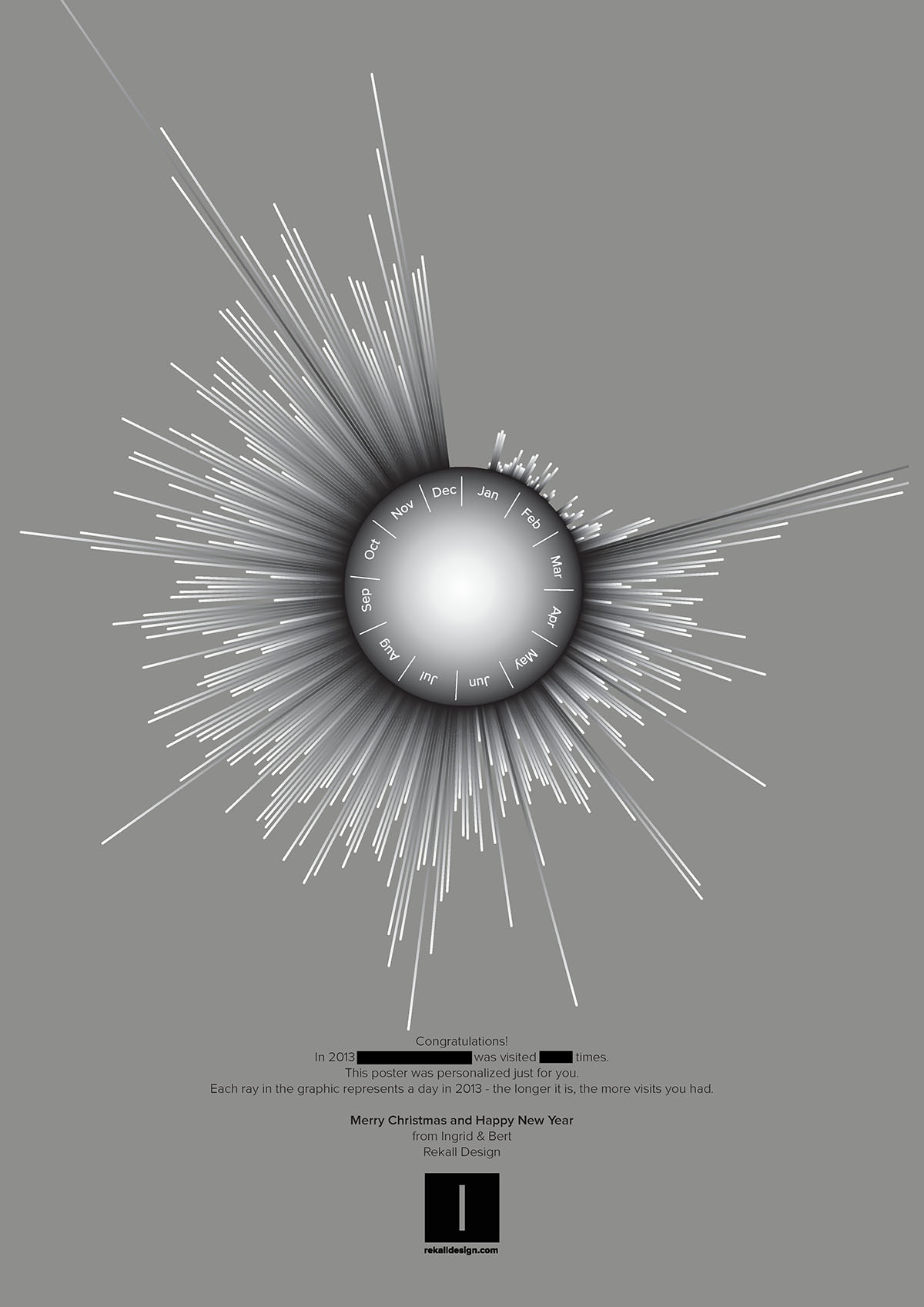
My basic idea was a spherical object with lights in the center. In hindsight it turned out well that I didn’t spend that much time on perfecting concept and design, because the process involves many steps, and in each phase decisions have to be taken that influence the final outcome. My advice to those getting started with similar project would be to start with a simple idea and proceed fast from there, trying out different techniques and materials in the process. These are powerful techniques, but don’t expect to get the exact result you have in mind for your first project. Be prepared to improvise. Also be aware that this whole process took a couple of days to complete. Don’t expect to do this in one afternoon if you haven’t done it before.

2. Design

This project also was an excuse to try out He_Mesh, a Processing library by Frederik Vanhoutte. The He in He_Mesh stands for Half-Edge data structure, which is one of the many ways to store information about a mesh. I didn’t go to deep in the underlying logic because it seems rather esoteric knowledge. From what I understand, this is an computationally efficient way to work with meshes, enabling us to do all kinds of interesting manipulations without having to worry about how things work behind the scenes.

Here are a few interesting projects that make use of He_Mesh:

  • Matthew Plummer-Fernandez is interested in remixing everyday objects and cultural icons such as Mickey Mouse. He raises all kinds of interesting questions related to originality and copyrights.
  • HemeshGui is a graphical interface for He_Mesh, meaning you can experiment without writing code. It doesn’t expose all of the features of the library, but it is a good way to get a feeling for its possibilities. HemeshGui doesn’t seem the work perfectly with the latest He_Mesh version, but I’ve opened an issue with a possible solution.
  • easySunflow is a software written in Processing that can used to create high quality images of He_Mesh objects with the Sunflow renderer.

It can be a bit hard to get started with He_Mesh, so here is what I recommend:

  • Install HemeshGui and experiment with the parameters.
  • Start with Jan Vantomme’s excellent introductory series of blog posts.
  • Have a look at the tutorial folder in the library, especially the 1-4 are a good general intro.
  • Then it’s best to start playing around. If you get stuck, head for the reference folder in the distribution and check the Java docs in the doc folder.

I created a Github repository for the Processing source code. The code is short and simple to understand. It feels very similar to what you would do in a 3D software package. These are the basic steps in a He_Mesh program:

  1. Creating a mesh using a ‘creator’. This can be a geometric primitive such as a box or a sphere, or something more complex like a torus. Or you can provide it a list of vertices.
  2. Manipulating the mesh with ‘modifiers’ and ‘subdividors’. Examples include: skewing, smoothing, slicing, and so on.
  3. Rendering and/or saving.

Let’s see how that applies to my case. I started from a sphere:


HEC_Sphere creator = new HEC_Sphere();
creator.setRadius(200);
creator.setUFacets(16);
creator.setVFacets(16);
HE_Mesh = new HE_Mesh(creator);

Note that we set a few options, such as the radius and the number facets. Here is how that looks:

Then I applied the extrude modifier:


HEM_Extrude extrude = new HEM_Extrude();
extrude.setDistance(50);
extrude.setRelative(false);
extrude.setChamfer(5);
mesh.modify(extrude);

The chamfer option cuts of the edges of the extruded faces. I’ve disabled relative here, so the number 5 for the chamfer is absolute, not relative to the face size. This is the result:

Modifiers can be chained together. Here’s how we apply the bend modifier to the extrusions:


HEM_Bend bend = new HEM_Bend();
P = new WB_Plane(0, 0, 0, 0, 0, 1);
bend.setGroundPlane(P);
L = new WB_Line(0, 0, 1, 0, 0, -1);
bend.setBendAxis(L);
bend.setAngleFactor(0.25);
bend.setPosOnly(false);
mesh.modify(bend);

This one is a bit more complicated, because He_Mesh gives us a lot of control over how we bend the mesh. We need to give this modifier a plane. I’ve used the XY plane here. The part of the mesh that will be above the ground plane will be bent in one way, and what is under it in the other direction. We also have to specify the axis around which we will bend, which is the Z-axis here. The following image should make it more clear:

The angle factor determines how much bending is applied. I’ve disabled ‘positive only’ because I also want the modifier to be applied on the negative side, which is the part of the sphere under the ground plane.

And finally, I applied the Catmull-Clark subdividor, which smoothens the extrusions. This is the code:


HES_CatmullClark catmullClark = new HES_CatmullClark();
mesh.subdivide(catmullClark);

And this is the result:

Rendering can be done like this:


WB_Render render = render = new WB_Render(this);

fill(200);
noStroke();
render.drawFaces(mesh);

noFill();
stroke(10);
render.drawEdges(mesh);

Exporting to a OBJ format is simple:


HET_Export.saveToOBJ(mesh, sketchPath("lamp.obj"));

3. Preparing the mold

This part of the process is largely depends on the Rhino 3D package. I wasn’t familiar with it, so it took me some time to get used to it. I also wouldn’t have made without the help from skilled people like Anastasia, Moushira and Martin. Thank you!

If you haven’t used Rhino before, I’d suggest taking a few hours to get comfortable with the software. The most important things to understand for projects like these are:

  • Using the Rhino command line
  • Moving around
  • Making selections
  • Showing and hiding objects
  • Drawing primitives
  • Positioning objects
  • Boolean operations

For me this dependency on relatively expensive piece of software is a bit strange. I’m also not such a big fan of the interface, it feels kind of awkward and 90s. It would interesting to see if this part of the process can be done with cheaper/nicer/open-source tools. There’s two main reasons to use Rhino:

  1. Boolean operations. I couldn’t find a way to do this with Processing, but Frederik mentions that he plans to support this in He_Mesh. That would be awesome because that would mean that one more step of the process could be automated.
  2. Preparing the instructions for the CNC machine. This is actually not handled by Rhino itself, but by a very expensive plugin. I can’t imagine that it wouldn’t be that easy to find a replacement for that tool.

Rhino is also still mostly a Windows affair. I’ve used the Mac beta (of September 2012), which seems to work well. It is available for free as long until the final release version will come out, which is unknown at this time. Biggest disadvantage is that most plugins don’t work, including the one we used to create the instructions for the milling machine.

But why do we need a 3D package anyway? Can’t we just send the file to a machine as it is and have it figure out what to do with it? We should actually take a step back here and look at what we want to do. We’re going to create a mold here, which we will fill with resin later. The mold consists of two halves that form a box together. Here’s how we modelled that box in Rhino:

Then we imported the OBJ output of the Processing sketch. Using Rhino’s boolean tools, we hollowed out the surface of the lamp from the box. The trick here is to make sure that the box and the object you want to make are of the same type. 3D software packages either prefer meshes (like Rhino) or solids (like Maya). The difference has to with the way a 3D geometry is stored. Since we drew the box in Rhino, it’s a mesh. The imported OBJ file is a mesh. If you want the boolean operation to succeed, both should be of the same type. We converted the box to a solid with the MeshtoNURB command. Then both the lamp and the box can be selected and the BooleanIntersection command can be applied. Here is a screenshot of one half of the box:

4. Fabricating the mold

Then it’s time to create the instructions for the CNC machine. I did this project at the FabLab Barcelona, where we have a Precix machine:

CNC machines are controlled with G-code instructions – similar to 3D-printers. An example of such an instruction is: “move to x 500 y 700, and drill a hole of 5 millimeters deep”.

We used RhinoCAM to create G-code. It takes a bit of trial and error to get things right, so you’ll need to go back and forward between the settings and the simulation. This honestly felt a little like a black art to me, something you can only learn by doing it many times.

Generally you’ll want two different stages:

  • roughing: first take away large portions of material quickly with a large drill
  • finishing: then do the finer work with a smaller drill

This is the roughing stage:

This process took about half an hour in my case. This second stage, the “parallel finishing” took a few hours:

You can clearly see the difference between the left and right side. This is how both sides look before cleaning:

5. Preparing for casting

After some initial tests, it was clear that I would need a huge amount of resin to cover the volume of the sphere. My first solution was to lasercut a box from plexiglass. I used BoxMaker, a little webapp that makes it easy to create a PDF with the necessary shapes for a box. The is how the box looks after glueing:

My plan was to hang it in the center and glue the LED’s on it:

And then I added ping pong balls to fill the rest of the volume:

Then it was time to prepare the mold for the resin. First, the foam mold needs to be covered with a product to seal all holes. After a 2 or 3 layers of this, another product needs to be applied that should make it easier to get the shape out of the mold.

I used a transparent resin. These products are quite expensive. I used one box, which is around €30 – €60. This is also pretty nasty toxic stuff, so wearing gloves and a mask is required. This is how it works: the products comes in separate 2 liquids, which need to be mixed in the correct proportions:

The two halves of the mold should be tightened together.

You’ll need three holes: one to pour in the liquid, another one for air, and, if you’re making a lamp: a hole for the wires.

The resin needs time to harden, I my case 24 hours. My mold was not 100% tightened, which made it very hard to open the mold without destroying it:

After some effort I got it out of the mold:

Personalized medals for runners, v2

Prototype for a personalized medal for runners, showing speed, distance and time. In this case the data is from a marathon, tracked with Nike +.

It works likes this:

  • The outer tick marks on the disc indicate time.
  • The spiral represents distance.
  • The graph shows speed.

Here is an interactive sketch demonstrating the idea. Use your mouse move to the medal around.


Your browser does not support the canvas tag.


JavaScript is required to view the contents of this page.

The concept

I started running back in 2010. Even though I’m just an amateur, it’s fun to keep statistics about my runs. I use Nike + to track my data. A cheap sensor inside your shoe measures stride length and sends this information to an iPod or iPhone via infrared signals. While you’re running the Nike + app shows pace, distance and time. After a run, data can be uploaded to a website where you can see statics of your runs.

Once in a while, in participate in a race. Usually you receive a medal upon crossing the finish line. While I like the symbolism of this gesture, it’s a pity that these medals are so uninspiring: they usually end up somewhere in the back of closet.

I became interested in the idea of personalizing medals. Each runner could receive a medal that tells his or her story of the race. By using data from systems such as Nike +, the medal can not only be a symbol of an achievement, it can also double as an information visualization.

Making of

The Nike + system doesn’t have an official API, but there are a few libraries for getting the data out of the webapp, for example Nike+PHP.

In this example I’m using data from a marathon I ran on September 9th, 2012. I used a PHP script to get the information from Nike + in JSON format. The data is a list that looks like this:

0,0,0.0072,0.0168,0.0288,0.0432,0.0669,0.0979,0.1221,0.158,0.1941,0.2237, …

Every 10 seconds, the software records the distance ran. Speed at a particular moment can be calculated by comparing distances.

The first image shows the result of a Processing sketch that calculates speed and plots it on a circle. It looks very jittery. This is because there can a lot of variance between strides: some are short, others are longer. As a result, the graphic is not very informative: there is too much going on, and it is hard to see trends.

As a solution, I used a rolling average: instead of showing the speed at a point in time, we calculate the average speed in period preceding it. This leads to a smoother graph that gives a much better sense of the differences through time. I created a quick and dirty interface to experiment with the Control P5 library, so I could experiment with the parameters for the algorithm.

Adding a scale on the medal itself would add a lot of visual noise. My solution for this was a transparent scale that sits above the graph and that rotates from the center. Next step was to add time and distance as well. I experimented with a few options, but in the end I represented distance as a spiral. Time is shown with a tick marks.

I’m very pleased with how this project turned out and I’m definitely going to continue it. I have a few ideas I want to explore:

  • Allow runners to compare their data: if their medals are transparent, then they could overlay them on top of each other.
  • Adding more data, such as heart rate.
  • Generate the medals in real time, while the race is in progress.

260 runs

I started running on February 26th 2010. Today, July 7th 2012, I finished run number 260, bringing the total to 2,746K.

This image is a visualization of this data. Each circle represent a run. Size corresponds to distance.

Tools used
Data was tracked with Nike +. I used Nike+PHP and PHP to get the data into a spreadsheet format. The visualization itself was done with Processing, using a particle system similar to the one I created in the Processing Paris masterclass.

35 days in NYC

I spent June 2012 at ITP Camp in New York. During that month I kept track of my whereabouts using OpenPaths, a free smartphone app from The New York Times.

OpenPaths doesn’t record your location continuously, it only takes occasional snapshots of where you are. Continuous usage of the GPS drains a phone battery very fas, that’s why. I believe that iOS can notify an app when the location has ‘significantly’ changed, and I think that’s what OpenPaths is using. From my experience the results are not always predictable, so the data is more a general picture of where you were rather than a detailed history.

The default way of representing OpenPaths data is by placing each tracked location on a map and connecting them with lines (as seen for example on the OpenPaths homepage). For me this is slightly problematic: just because I was at one location first, and at second one later doens’t mean that I travelled in a straight path from the first to the second. I was also interested in moving away from the typical Google Maps way of showing location data.

In this approach I used a particle system that traces my journeys trough lower Manhattan. The particles are attracted to the locations in my history, resulting in a more organic view of where I went during those 35 days (versus connecting points with straight lines).

The heavy black parts indicate where I spent most of my time: in and around ITP’s building on Broadway.

Tools used
Processing, particle systems, forces

Noisy chandelier

In this experiment, I wanted to create a 3D structure for a lamp from a 2D, flat material.

I created a Processing sketch that draws a set of concentric circles, with some noise applied to the shapes:

A 3D shape emerges when the shapes are spaced out along the Z-axis:

Here’s another view:

The Processing sketch spits out a PDF file ready for laser cutting.

I originally thought I could connect all the layers with threads, but that turned out to be too complicated, so I going to have to rethink how the piece can be assembled.

Visual Chronology

In June 2011 I was invited to participate in a hackathon by Europeana, an EU initiative focussed on opening up the digital archives of Europe’s museums, libraries, and archives to the public.

Among the tools they offer is an API that searches in all of these databases and returns results in a uniform way. So instead of having to query each of these sources individually, you can search them all in one go.

We had a few hours of time to experiment with the API and to come up with an interesting application. Here is what I worked on:

Visual Chronology – that’s what I called it – is a sketch displaying Europeana search results on a timeline. At the bottom of the screen, years are represented by dots. The larger a dot, the more results were found for that year. This info graphic doubles as navigation for jumping or scrolling through time. The tool could be applied in an exhibition context, for example with a touch screen interface.

This project received a prize in the ‘innovation’ category. Here is some coverage on the hackathon by the Picasso Museum in Barcelona, where the event tool place.

Tools used
Processing, Europeana API.

Particle system from Processing Paris workshop

In April 2011 I attended Processing Paris. I took part in the masterclass, led by Hartmut Bohnacker, one of the authors of Generative Design.

I learned a lot about simulating physics (or faking physics, which is ‘good enough’ in many cases). We experimented with particle systems, where a hole bunch of elements behave according to rules, such as ‘move around in circles’, or: ‘change direction randomly’. When the elements interact with each other -for example: ‘maintain a minimum distance between neighbours’ – this can lead to emergence: the sum of the whole is greater than the sum of its parts.

Here is a video of the results of the masterclass. The first animation is mine.

Processing Paris Workshops 2011 from Processing Paris on Vimeo.

Continue reading