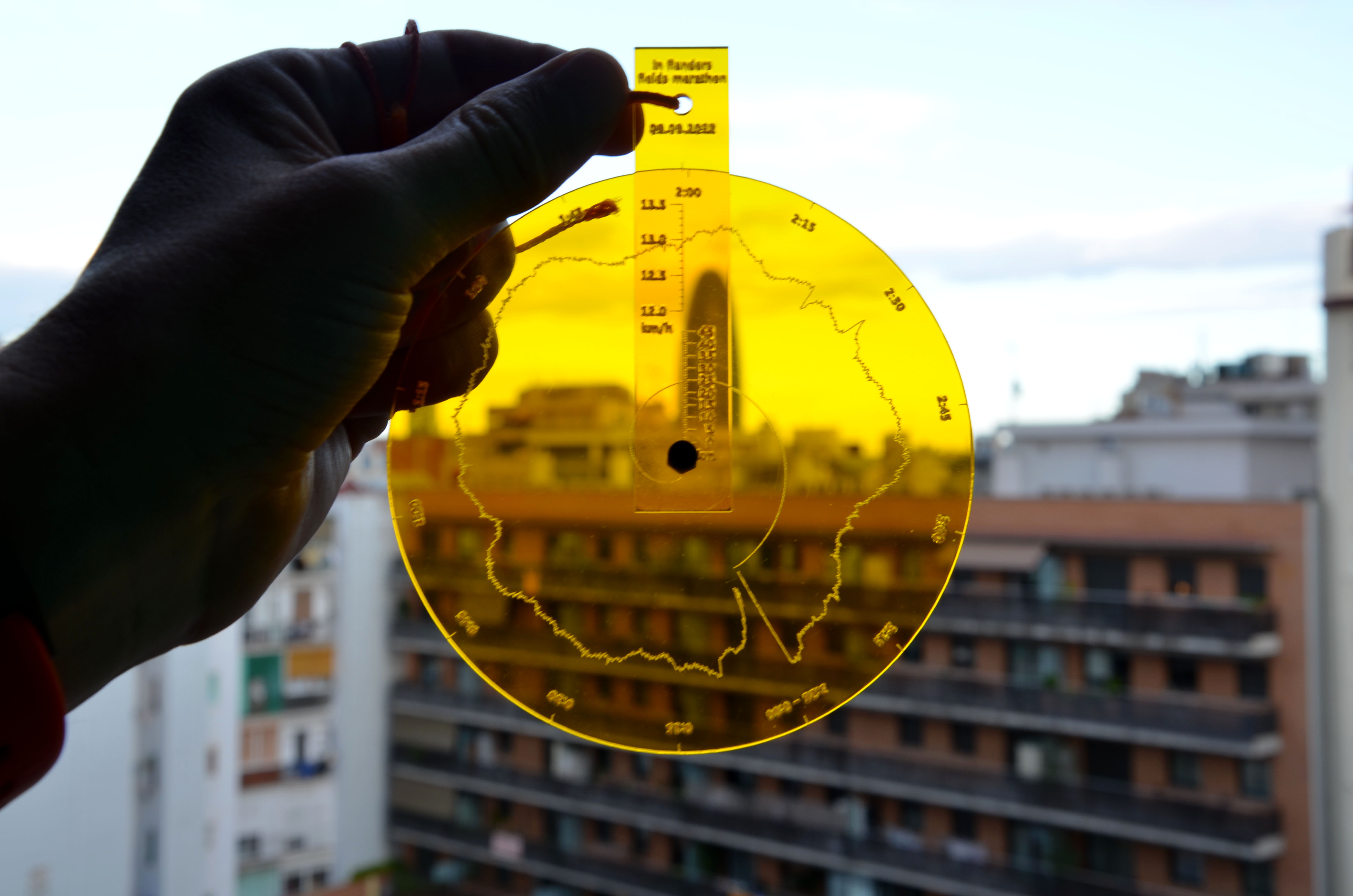
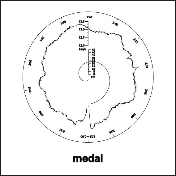
Prototype for a personalized medal for runners, showing speed, distance and time. In this case the data is from a marathon, tracked with Nike +.
It works likes this:
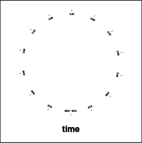
- The outer tick marks on the disc indicate time.
- The spiral represents distance.
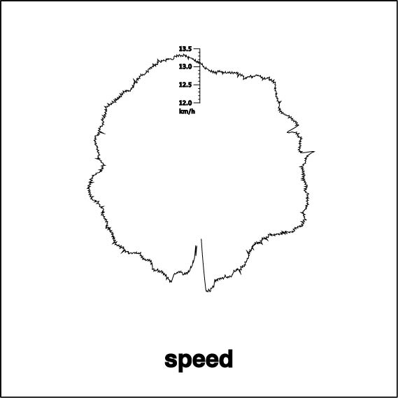
- The graph shows speed.
Here is an interactive sketch demonstrating the idea. Use your mouse move to the medal around.
The concept
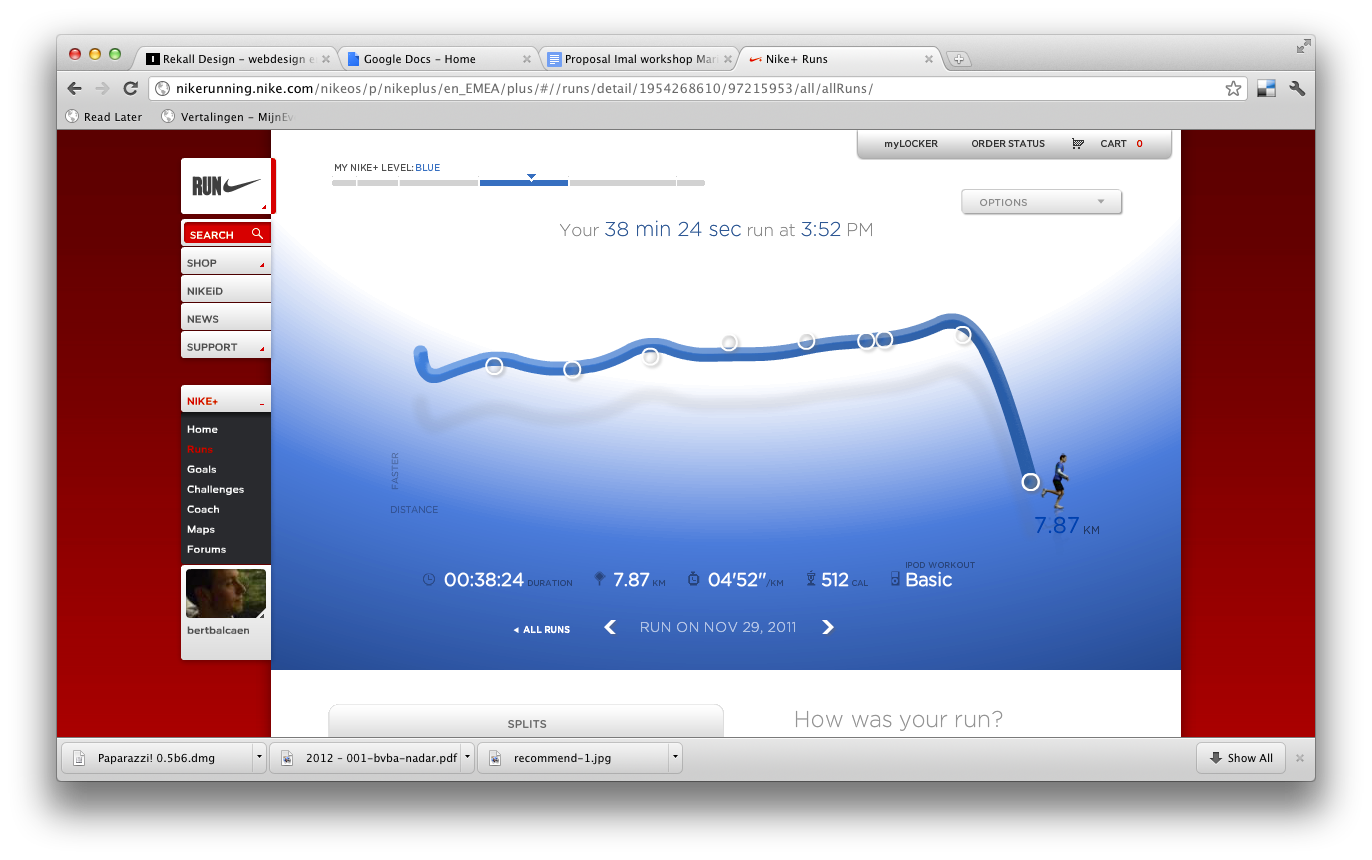
I started running back in 2010. Even though I’m just an amateur, it’s fun to keep statistics about my runs. I use Nike + to track my data. A cheap sensor inside your shoe measures stride length and sends this information to an iPod or iPhone via infrared signals. While you’re running the Nike + app shows pace, distance and time. After a run, data can be uploaded to a website where you can see statics of your runs.
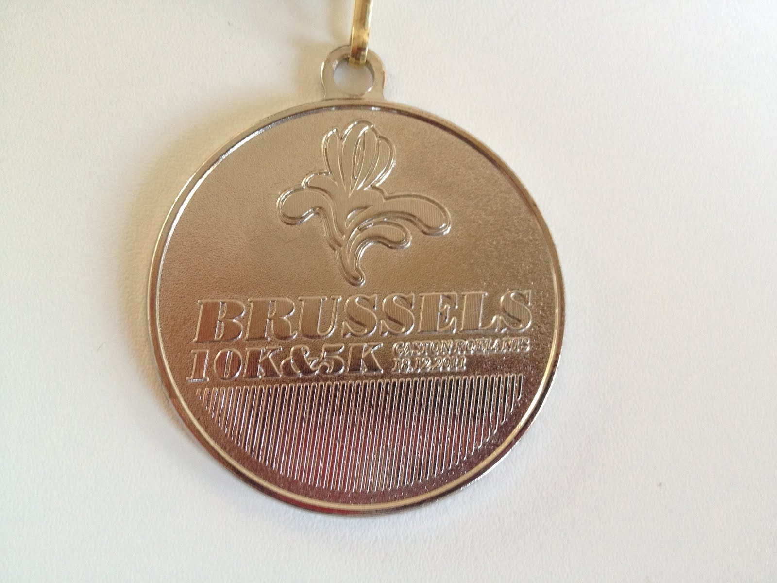
Once in a while, in participate in a race. Usually you receive a medal upon crossing the finish line. While I like the symbolism of this gesture, it’s a pity that these medals are so uninspiring: they usually end up somewhere in the back of closet.
I became interested in the idea of personalizing medals. Each runner could receive a medal that tells his or her story of the race. By using data from systems such as Nike +, the medal can not only be a symbol of an achievement, it can also double as an information visualization.
Making of
The Nike + system doesn’t have an official API, but there are a few libraries for getting the data out of the webapp, for example Nike+PHP.
In this example I’m using data from a marathon I ran on September 9th, 2012. I used a PHP script to get the information from Nike + in JSON format. The data is a list that looks like this:
0,0,0.0072,0.0168,0.0288,0.0432,0.0669,0.0979,0.1221,0.158,0.1941,0.2237, …
Every 10 seconds, the software records the distance ran. Speed at a particular moment can be calculated by comparing distances.
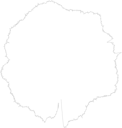
The first image shows the result of a Processing sketch that calculates speed and plots it on a circle. It looks very jittery. This is because there can a lot of variance between strides: some are short, others are longer. As a result, the graphic is not very informative: there is too much going on, and it is hard to see trends.
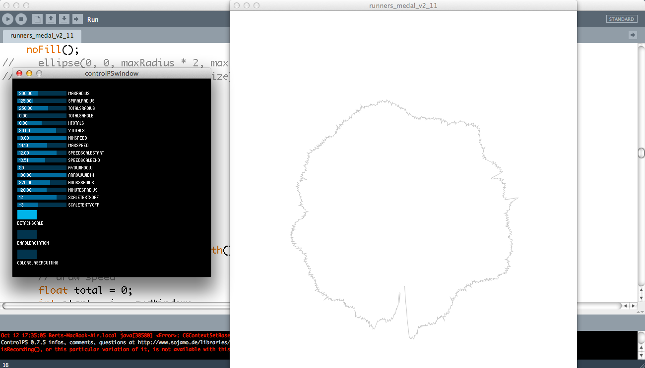
As a solution, I used a rolling average: instead of showing the speed at a point in time, we calculate the average speed in period preceding it. This leads to a smoother graph that gives a much better sense of the differences through time. I created a quick and dirty interface to experiment with the Control P5 library, so I could experiment with the parameters for the algorithm.
Adding a scale on the medal itself would add a lot of visual noise. My solution for this was a transparent scale that sits above the graph and that rotates from the center. Next step was to add time and distance as well. I experimented with a few options, but in the end I represented distance as a spiral. Time is shown with a tick marks.
I’m very pleased with how this project turned out and I’m definitely going to continue it. I have a few ideas I want to explore:
- Allow runners to compare their data: if their medals are transparent, then they could overlay them on top of each other.
- Adding more data, such as heart rate.
- Generate the medals in real time, while the race is in progress.
